

Yogang
Discover every Angle

Social Media Reimagined
Overview
Yogang is a social media app designed to make online conversations more meaningful and organized. Instead of unstructured threads, users categorize their posts as Opinion, Issue, Support, Opposition, or Proof. Posts connect visually in a Post Map, allowing users to explore discussions in a structured way.
ROLE
-
Co-founder & Lead UX/UI Designer
-
Responsible for user research, wireframing, prototyping, and final UI design
-
Collaborated on product strategy and feature prioritization
TIMELINE
Nov 2023 - Present
Problem
Most social platforms lead to chaotic, unstructured discussions where valuable insights are lost in long threads. There’s no clear way to track the flow of ideas or weigh support vs opposition.
1. Echo chambers
2. No exposure to opposing ideas
How can we expose users to opposing perspectives?
Solution
Post Map
Designed an interactive Post Map where related posts are connected visually

Post Types
Introduced post types to structure contributions (Opinion, Issue, Support, Opposition, Proof)

Topic Page
Showing a Post Map for that Topic with geographic pins. Visualizing where perspectives are clustering.

Result
-
Delivered a prototype showcasing structured, contextualized discussions
-
Test users found it valuable to see where ideas originated, helping them better understand potential biases in a conversation
-
The Topics feature increased engagement by giving users ownership over communities and discussions
-
Geographic pinning added a new layer of meaning, helping distinguish Yogang from other social platforms
Research
Analyzed platforms like Reddit communities, Facebook Groups, and geographic polling data for inspiration


Key finding
“Social media sites foster confirmation bias because of their basic function. … Social media companies therefore rely on adaptive algorithms to assess our interests and flood us with information that will keep us scrolling.”
— University of Texas at Austin, Moody College of Communication
Design Exploration
How might we design a feed that surfaces the strongest opposing perspectives in a clear and digestible format?
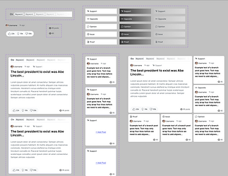
Wireframes & Prototyping
Created flows for posting, browsing, viewing Post Maps, Iterated on Topic creation flows and integrated an interactive geographic map into the Post Map experience

Basic wireframe

Deciding the arrangement of the post types

Adding color and more UI elements

Final design for post map
RESPONSIVE MOBILE VIEW

Basic wireframe

Responsive scrolling behavior
.png)
.png)
Final designs for linking posts and home feed
Visual Design
Crafted a clean, modern interface balancing the complexity of Post Maps with simple, scrollable feed. Our brand colors remain neutral to reflect our approach to offer users with the best competing ideas.
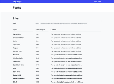
Design System
We designed Yogang’s system to follow familiar spacing and text sizing conventions from modern social apps, ensuring a consistent and intuitive experience. Our neutral-based color palette, drawn from Yogang’s branding, created a distinct yet balanced visual identity that highlighted content without distraction.


Icons

BRANDING
The name Yogang comes from a traditional Korean jar once used for waste, but later repurposed by many Koreans to store treats and goodies. We found this transformation meaningful and symbolic of our vision: turning today’s chaotic online discourse into something valuable and worth keeping.


.png)